
Matching Caption Style to Your Podcast Niche

Match your caption style to your niche, not to whatever looks busiest in the feed. Bold, word-by-word karaoke captions fit comedy and gaming, where energy is the product. Clean, restrained two-line captions fit finance, faith, and news, where trust is the product. Emphasis-word styling, one highlighted keyword per line, fits education and how-to, where comprehension is the product.
The reason this matters is the part most editors miss: a caption style is a signal before it is a subtitle. Within the first second, before anyone reads a word, the look of your captions tells a viewer what kind of show this is and whether it is for them. Get the register wrong and you fight your own clip, a serious finance take wrapped in bouncing neon reads as a meme, and a comedy bit set in calm grey text reads as a lecture. This guide gives you the pairing matrix, the one-line rule for choosing, and the per-niche specifics.
Why caption style is a niche signal, not just legibility
Legibility is the floor. Every caption has to be readable on a muted phone screen, because most social video is watched with the sound off, a directional figure put at roughly 85% by Digiday back in 2016, with later studies landing anywhere from about 69% to 85%, so treat it as a range, not a law. That part is settled: large text, high contrast, kept clear of the lower-third UI. Where editors stop thinking is one step past legibility, at register, how loud, how animated, how decorated the captions are.
Register is read as tone. A viewer who has seen ten thousand clips has learned, without trying, that giant bouncing word-by-word text means "high-energy, low-stakes, react and move on," and that calm centered text means "this person wants to be taken seriously." Those associations are real whether you like them or not. The clip economy has made them sharper: TikTok, Instagram, X, and YouTube are flooded with bite-sized podcast snippets, the feed is denser than ever, so the visual shorthand is doing more sorting than ever. Your captions are a costume. Dress the clip for the room it is walking into.
The one-line rule for choosing a register
Pick the register that matches the single emotion you want the viewer to feel before they decide whether to stay: excited, curious, or reassured. Excited gets bold karaoke. Curious gets emphasis-word styling that holds a key idea on screen long enough to register. Reassured gets clean, calm captions that get out of the speaker's way. If you can name the emotion, you have already chosen the style.
This is faster than it sounds, and it stops the most common waste in clip editing: re-deciding caption design every single clip. You decide the register once, per show, save it as a template, and apply it to every clip. The decision is at the show level because the niche is at the show level. Your audience is the same people every time; the costume should be too.
The three registers, defined
There are really only three caption registers worth knowing. Everything else is a variation on one of them.
- Bold karaoke (word-by-word). Each word pops onto the screen as it is spoken, large, often in a second highlight color, sometimes with a small scale or bounce. It manufactures pace. It reads as fun and disposable, which is exactly right when fun and disposable is the point.
- Emphasis-word (steady lines, one highlight). A normal one- or two-line caption sits on screen, but one load-bearing word per line is colored or weighted. It keeps the eye on the idea instead of chasing each word. It reads as "there is something here to learn."
- Clean two-line (restrained). Two lines max, centered or low, neutral weight, one accent color at most, no movement. It reads as serious, credible, adult. It disappears into the speaker, which is the goal when the speaker's authority is the draw.
The pairing, niche by niche
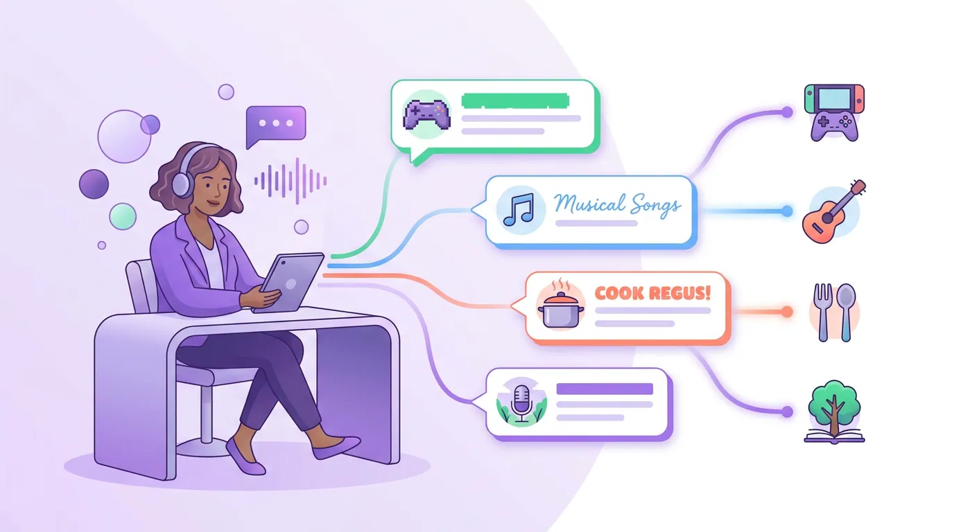
The matrix above is the map. Here is the reasoning per zone, so you can place a niche it doesn't list.
Comedy, gaming, sports, pop culture → bold karaoke
These niches sell energy and reaction. Comedy is the most-listened US podcast genre, ahead of news, society and culture, and true crime (Statista), which means the largest audience and the most crowded feed, so a clip has to broadcast "this is fun" instantly. Word-by-word captions do that before a single line is read. They also rescue timing on mute: in a comedy clip the laugh and the beat carry the joke, and animated text keeps the energy visible when the sound is off. For more on protecting the joke itself, see clipping comedy podcasts without killing the joke. Gaming and sports inherit the same logic, hype is the genre, so the captions should look hyped.
Finance, faith, news and politics, health → clean restraint
These niches sell trust, and bouncing neon text actively undermines it. A finance host explaining a tax strategy in karaoke captions looks like a get-rich-quick account, no matter how sound the advice is. Faith, health, and serious news carry the same weight, the viewer is deciding whether to believe this person, and decoration reads as a reason not to. Clean two-line captions, one restrained accent color, no movement: the captions vanish and the speaker's credibility comes through. The honest tradeoff is that restrained clips can look slower in the feed, so you earn attention with the cut and the hook, not the font. True crime is the interesting edge case, serious subject, but suspense-driven, where restrained captions plus a hard cliffhanger cut point usually beat anything flashy; the genre is built on which true crime moments actually clip well, not on caption flash.
Education, tech, how-to, marketing → emphasis-word
These niches sell comprehension, and the job of the caption is to make the key idea stick. Emphasis-word styling, steady lines with one highlighted keyword, keeps the viewer's eye on the concept instead of racing each word. It is calmer than karaoke but more directive than plain text, which suits a clip whose whole purpose is to teach one thing. A business podcast clip strategy leans on this register hard: the takeaway is the asset, so light up the takeaway word and let the rest recede.
How to apply this in an AI clipping workflow
Most AI clippers, including QuickReel, ship a library of caption styles, QuickReel has 12-plus, with brand templates you can save (QuickReel pricing). The mistake is treating that menu as a per-clip decision. It is a per-show decision.
- Decide the register once. Use the one-line rule, excited, curious, or reassured, and pick bold, emphasis-word, or clean.
- Build it into a brand template. Set the font, the highlight color, the line count, the position above the platform UI, and save it. Now every clip inherits the register automatically.
- Let AI place the words, you own the style. AI handles transcription, timing, and word-level sync well; the detection step and the styling are separate jobs. You are choosing the costume, not retyping captions.
- Override only at the moment, not the show level. If one clip has a single line that deserves a bigger pop, bump that one line. Don't redesign the whole register for it.
This is the difference between caption styling being a recurring decision and a one-time setup. The register is part of your show's identity, so it lives at the show level, same as your cover art or your intro.
Common mistakes (and the fix)
- Copying whatever's trending instead of fitting the niche. Bold karaoke is everywhere because comedy and gaming clips are everywhere, so editors in serious niches copy it and quietly cheapen their own clips. Fix: choose by your niche's core emotion, not by the feed's loudest format.
- Maxing out animation "because it boosts retention." Movement helps energy niches and hurts trust niches; there is no universal retention win in bouncing text. Fix: match motion to register, animated for excited, still for reassured.
- Too many words on screen at once. A wall of text is unreadable on mute regardless of niche. Fix: one to two lines, and never more than you can read in the time the line is up.
- Captions colliding with the platform UI. Text behind the TikTok caption box or the Reels buttons is just gone. Fix: set a safe zone in your template, once, and every clip respects it. The same discipline that helps you pick the best AI-suggested clips applies here, small fixes compound across a batch.
- Switching styles clip to clip. Inconsistent captions break the show's visual identity and make a feed look like five different accounts. Fix: lock the register in a template and leave it.
FAQ
Does caption style actually change how a clip performs?
Style won't save a weak clip, and there is no clean public number proving one register beats another across niches, anyone claiming a fixed percentage is guessing. What is defensible: captions of some kind are close to mandatory because most social video is watched muted (Digiday, directional, 2016), and register sets expectations in the first second. Treat style as a fit problem, not a magic lever, and A/B test within your own show.
Should every clip from one episode use the same caption style?
Yes, keep the register identical across an episode's clips and across your whole show. The register is part of your visual identity, like cover art. Vary the content and the cut, not the caption style. The only exception is bumping a single standout line within a clip, which still lives inside your chosen register.
What if my podcast spans two niches?
Pick the register for the audience you are trying to grow, not the topic of the individual clip. A show that is half comedy, half business should still choose one register and hold it, because the viewer is following you, not toggling between two identities. If the two halves are genuinely different audiences, that is usually a sign for two separate clip accounts, each with its own register.
Is bold karaoke ever wrong for comedy?
Rarely, but it happens with dry or deadpan comedy, where bouncing neon text fights the delivery. Deadpan works because it is understated, and loud captions oversell the line. If your comedy is dry, drop to emphasis-word styling and let the timing carry it, protecting punchline timing matters more than the font.