
Framing Two Speakers in One Vertical Clip

To fit two speakers in one 9:16 clip, pick one of four layouts based on the conversation: stacked (both faces, one above the other) for fast back-and-forth, active-speaker cut (the camera follows whoever's talking) for monologue-style answers, split-screen for reaction-heavy banter, and picture-in-picture when one person clearly leads. The mistake to avoid is the lazy center crop, which shrinks both heads to dots floating in a wide frame.
That center crop is why so many interview clips look amateur. A wide two-shot recorded for a 16:9 master, cropped straight down the middle to 9:16, leaves a sliver of each person and a lot of empty table. The fix is never to keep the wide shot, it's to choose a vertical layout that gives each face real screen space. Below: the four options drawn to scale, a rule for matching each to your conversation type, and the three reframing mistakes I see most when reviewing interview-clip batches.
Why two-speaker clips are harder than solo ones
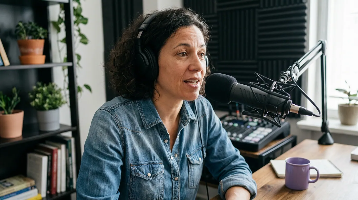
A solo clip is easy in vertical. One face, center it, done. Two speakers fight for the same narrow column, and most podcast interviews were never shot for it. The standard setup is a wide two-shot, two people across a table, framed in 16:9, which holds both faces comfortably in landscape and almost none of the vertical frame.
This matters because interview and conversation clips are a large share of what podcasts post, and clips are how new people find a show. Short-form clips drive an estimated 20–40% of new audience for video podcasts and can lift reach 2–5× (Podcast Studio Glasgow). A clip where both heads are too small to read emotion is a clip people scroll past, you paid the full editing cost for a fraction of the reach. Two faces, when they're framed well, also give you something a solo clip can't: visible reaction, the cutaway to a raised eyebrow, the moment one person lands a line and the other laughs. That reaction is the hook.
The four layouts for two heads in 9:16
There are exactly four workable ways to hold two speakers in a vertical frame. Each uses the 1080 × 1920 space differently, and each suits a different kind of conversation. Here they are drawn to scale, then a rule for choosing.
1. Stacked. Both faces, one above the other, each filling the full width of the frame. This is the workhorse for two-person podcasts. It keeps both people visible at all times, so reactions read instantly, and each face gets the full 1080-pixel width, far bigger than a side-by-side split. The cost: each person gets only half the height, so you want tight head-and-shoulders crops, not full bodies.
2. Active-speaker cut. One face fills the frame at a time, and the clip cuts to whoever is talking. This buys you the largest possible face, full-frame, which is best for emotional or detailed answers where you want the viewer locked on one person's delivery. The risk is that you lose the listener's reaction, and if the cuts lag the audio by even a fraction of a second, it feels broken. Good cutting hides the seams.
3. Split-screen. Two faces side by side, each in a tall half of the frame. It keeps both people on screen like stacking does, but in a 9:16 frame each half is narrow, so faces end up smaller and you often see more background than face. Split-screen earns its place for reaction-heavy banter where the side-by-side framing reads as "two people on a call," but it's the weakest at face size of the four.
4. Picture-in-picture. One person large, the other in a small inset corner. Use it when one person clearly leads, a host interviewing a guest, where the guest is the focus and you want the host present but secondary. It reads cleanly when the hierarchy is real. It reads odd when the two are equals, because the inset implies one matters less.
Which layout for which conversation
Match the layout to how the two people actually talk, not to how the footage was shot. The decision tree below is the short version; the table after it adds the trade-off you're accepting in each case.
| Conversation type | Best layout | The trade-off you accept |
|---|---|---|
| Fast back-and-forth, co-hosts | Stacked | Half-height each, crop tight to head-and-shoulders |
| One person's detailed answer | Active-speaker cut | You lose the listener's reaction during the cut |
| Reaction banter, two equals | Split-screen | Smallest faces of the four; more background shows |
| Host interviewing a guest | Picture-in-picture | Implies hierarchy, wrong if the two are equals |
The single most useful default: when you're not sure, stack them. It keeps both faces visible, gives each the full frame width, and never implies one person matters less. It's the layout that goes wrong the least often.
Three reframing mistakes that wreck two-speaker clips
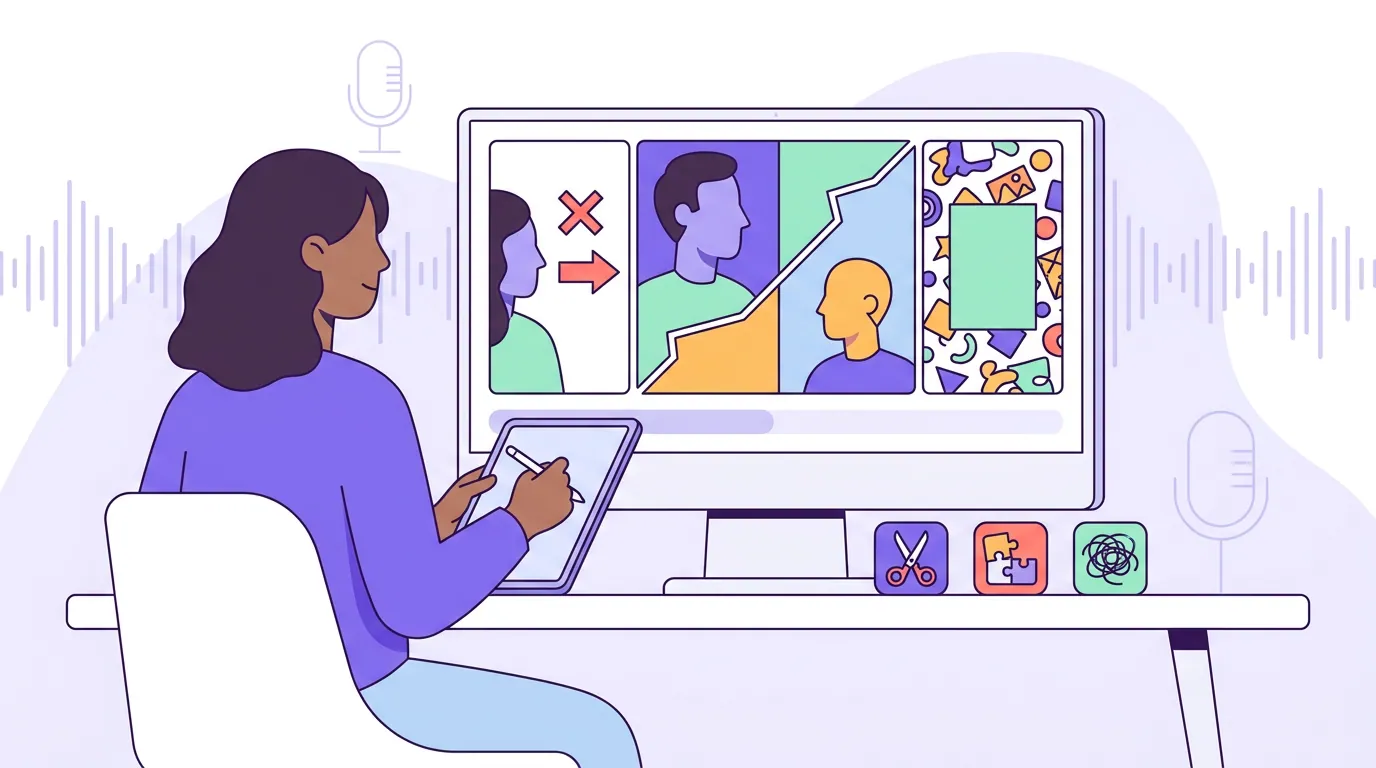
These are the errors I see most often when reviewing interview-clip batches. Each one is cheap to fix once you spot it.
- Keeping the wide two-shot and center-cropping. This is the original sin, it produces the tiny floating heads above. The wide shot was framed for landscape; the middle of it is mostly table. Never crop the source frame as-is. Choose a layout that discards the empty width and uses the vertical height for faces.
- Reaction cuts that lag the audio. With an active-speaker layout, the cut has to land on the word, not a beat after it. A late cut makes the clip feel like a glitch, and viewers bail in the first few seconds, the exact window castmagic calls "absolutely critical for social media success," because that's when people decide whether to keep watching (castmagic). If you can't cut clean, default to stacked so you never need a cut at all.
- Faces or names buried in the platform's UI zone. Every vertical feed overlays its own interface. On a 1080 × 1920 TikTok frame (Descript), the caption, buttons, and music strip leave a text-safe area of roughly 1080 × 1420, about 500 pixels of height eaten by UI, most of it along the bottom (Kreatli). In a stacked layout the bottom face sits dangerously low, nudge both faces up into the center band so the platform doesn't draw its buttons across someone's chin. If your clip still looks flat after fixing the frame, the problem may be elsewhere; our guide to why podcast clips get no views covers the rest.
The tools: by hand vs speaker-aware
By hand, two-speaker reframing is the slow part of clip editing. In CapCut, Premiere, or DaVinci Resolve you set keyframes to pan and scale each speaker, or you mask and stack the two faces manually, and you redo it for every cut where someone moves. Budget 30–60 minutes per finished clip once captions are added, and more for active-speaker cutting because every cut is a manual decision.
Speaker-aware tools collapse that. They detect who's talking and reframe automatically, following the active speaker, or stacking both faces, so the wide source becomes a usable vertical without keyframing. QuickReel does this, and so do alternatives like Opus Clip and Vizard. The honest framing: most modern tools find broadly the same moments and reframe similarly well, so the real difference is how few clicks sit between a YouTube URL and a posted clip, and how cleanly the speaker tracking holds when people lean or gesture. Whichever you use, plan to review every clip by hand before posting, check that the right speaker is in frame, that no cut lags, and that nothing important sits in the UI dead zone. It's an accelerant, not a replacement editor. See how AI clip detection actually finds and follows the talker and how to pick the best AI-suggested clips for the review pass.
FAQ
How do you fit two people in a vertical video without shrinking them? Don't keep the wide two-shot. Choose a layout that uses the vertical height for faces: stack both faces top and bottom, cut to the active speaker one at a time, or split the screen. Each gives a face far more pixels than a center crop of the original landscape frame, which is what leaves both heads tiny.
What's the best layout for an interview clip in 9:16? For a host-and-guest interview where the guest is the focus, picture-in-picture or active-speaker cutting works best, it keeps the largest face on the person who matters. For two co-hosts trading lines quickly, stacked is better because it keeps both faces visible the whole time so reactions read.
Should I use split-screen or stacked for two speakers? Stacked usually wins. In a 9:16 frame, a side-by-side split makes each face narrow and shows more background, while stacking gives each face the full frame width. Reserve split-screen for reaction-heavy banter where seeing both people side by side is the point.
Why do my interview clips look like two tiny floating heads? Because you're center-cropping a wide landscape two-shot to vertical. The middle of that frame is mostly empty table, so both heads end up small. Switch to a stacked or active-speaker layout that throws away the empty width and fills the height with faces.
Can AI frame two speakers automatically? Yes. Speaker-aware clipping tools detect who's talking and reframe to follow them or stack both faces, turning a wide recording into a usable vertical without manual keyframing. Plan to review each clip, though, automatic tracking can put the wrong person in frame during overlaps, so a quick human touch-up before posting is worth the minute it takes.
Related guides: fixing a clip exported in the wrong aspect ratio, nine fixes that add movement to boring clips, and why your podcast clips get no views.